
Why Mobile-Responsive Design Isn’t Optional in 2025
If your website doesn’t look or function well on a mobile phone in 2025, your business is losing money — plain and simple. With mobile devices dominating online activity in South Africa, mobile-responsive design is no longer a luxury, it’s an absolute necessity.
Whether you’re a small business owner in Cape Town or a national brand in Johannesburg, having a website that adapts seamlessly to smartphones and tablets is essential for user experience, visibility and conversions.
What Is Mobile-Responsive Design?
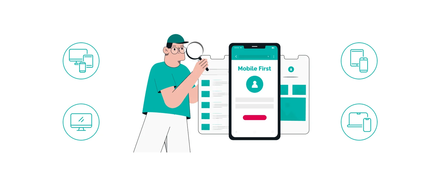
Mobile-responsive design means your website adjusts automatically to fit any screen size, whether it’s a desktop monitor, a tablet, or a smartphone. This ensures that content, images, navigation and layout are all optimised for smaller screens without users needing to zoom or scroll awkwardly.
It’s not just about “looking nice” on mobile — it’s about functionality, accessibility, and keeping people engaged.
Why It Matters More Than Ever in 2025
1. Most South Africans Browse on Mobile
According to Statista, over 70% of all web traffic in South Africa comes from mobile devices. Whether it’s someone searching for a plumber in Sandton or shopping online in Durban, they’re likely doing it from their phone.
If your site isn’t responsive, you’re immediately frustrating a majority of your audience.
2. Google Prioritises Mobile-Friendly Sites
Google uses mobile-first indexing, which means it looks at the mobile version of your website first when deciding how to rank you. If your site isn’t mobile-responsive, your rankings and organic traffic will suffer.
You can test your website’s mobile usability using Google’s Mobile-Friendly Test.
3. Better User Experience = Higher Conversions
Visitors won’t wait for a site to load slowly, struggle to click tiny buttons, or scroll endlessly on a broken layout. Mobile responsiveness enhances the experience, reduces bounce rates and increases the chances that users will stay, browse and take action.
4. Social Media Traffic Comes from Mobile
South African users spend significant time on platforms like Facebook, Instagram, WhatsApp and TikTok mostly from mobile. When you promote your business on these channels, your site needs to be ready for the device they’re using.
If your link sends them to a clumsy, desktop-only website, you’ll likely lose the click and the lead.
5. It Builds Trust and Professionalism
A clean, mobile-friendly site tells customers that you take your business seriously. It shows attention to detail, care for user experience, and digital professionalism. In contrast, a non-responsive site can appear outdated and unreliable — even if your services are excellent.
What Makes a Website Truly Mobile-Responsive?
-
Flexible layouts that adjust to screen size
-
Readable text without zooming
-
Tap-friendly buttons and menus
-
Fast load speeds on mobile data
-
Images and videos that scale correctly
-
Minimal pop-ups or disruptive elements
A good responsive site doesn’t just “shrink” the desktop version — it’s designed for mobile from the beginning.
Common Mobile Design Mistakes to Avoid
-
Using font sizes that are too small
-
Failing to optimise images for speed
-
Menus that are hard to tap
-
Pop-ups that block the screen
-
Clickable elements too close together
Use platforms like WordPress, Webflow or Shopify which offer responsive templates, or work with a professional developer to custom-build your site to be mobile-first.
Final Thought
In 2025, mobile-responsive website design is non-negotiable. South African consumers expect fast, functional, beautiful mobile experiences — and so does Google. Whether you’re building a new site or reviewing your current one, now is the time to make mobile responsiveness your top priority.
At Vervi8 Solutions, we specialise in building fast, mobile-optimised websites that convert. Let us help you bring your digital presence in line with today’s standards — and tomorrow’s opportunities.